Monday, February 3, 2014

Thesis Process 1


It has been a while since I did something or wrote anything. After a long vacation getting back to work mode was not easy, but I think I finally did it.

I was not sure where to start but in order to start making I had to start somewhere. So I started writing down the points that I want to communicate. I felt like there is so much on my mind and working on all of them in such a short time is not possible. I was hoping to narrow myself down by writing down all my thoughts and hopefully find a starting point.


I started with the map drawings of  “ My world”. I researched and found the name of all the countries in the world and looked up all the ones that I need a visa to and the ones that I don’t through http://www.doyouneedvisa.com . I decided to only draw the countries that allows me to travel to them without any hassle on the map to see really how much of this planet is really part of my world. I used watercolor to bring in the colors of a regular map into it. I thought it would be interesting to see how much blue and how much of it will be green.


I find this quick test both successful and unsuccessful. Successful because I is shows how ridicules the map looks! Only 10 countries out of 195 (http://www.nationsonline.org/ ) allow me to travel to them freely. 

However, I realized that maybe I should only deduct the countries that give me a hard time before traveling to them. For example I have to fill forms and go through a process, pay money in order for them to let me travel to them or even transit through them. I thought, it would not be fare to put Seri Lanka on the same level as New Zealand. When Traveling to Seri Lanka for Iranian Nationals then issue the visa upon arrival at the airport but when I was flying back from Sydney to California ( I already have a visa for the United States) by Air New Zealand I had to apply for a transit visa and pay $150 for a 3 hour stop! I was lucky that I looked it up, otherwise I would loose my flight and had to postpone my fly back for about 2 weeks. Getting a Visa is usually not a quick and easy process.

So I decided to add the “Visa upon arrival countries as well:


I find this attempt a lot more successful not only because now I believe I have pictured a more fair condition but also the simplicity of the map, helps us see much better. Therefor I decided to still keep color out of these series. As a next step of these studies I would like to apply the same strategy to a few other countries and see them in comparison.

As I was working on the previews work I occurred to me that I have removed the name of the countries on the map and I only kept their imaginary borders. What if I remove all the borders and just place the names on the map. How would that look like.


Not only visually this map grabbed my attention but also I found it a good research material. My next step with this would be printing it big and having it up on the wall and asking people to draw the borders of the countries out of their memories.
As a conclusion of the previous study I decided to run a few other studies based on what if the borders didn't exist or if they where different than what we know today.


Saturday, November 23, 2013

Borders Barriers and Walls


R&D update:

Before the Midterm

Alongside of making the new spaces that I shared with you in my previous blog I was making something that represents the actual height of the wall. I always thought that the height of these walls is one of the most important qualities. It’s the height of those cement walls that stops you from seeing the people on the other side; dehumanize the other side of the wall. It is the height of the wall that casts a shadow on your house forever. Since dealing with heavy materials was not easy I decided to cut a piece of paper to the height of the wall and have it hang on the pass-way of people and observe their reaction and the changes it creates in their regular path. Unfortunately the scale and size of the paper was not something to easily maintain, therefor I decided just to hand it from anywhere possible. I thought at least I get an idea how tall this wall is. Bellow are a few pictures I have taken from that experiment. 


When I had the wall on the floor I tried photographing it but as I looked through the images I realized none of them do justice to the height of the wall therefor I decided to lie down on the paper so comparison helps visualizing the length so some extend. I am 5.4 foot/ 164 cm high.


This is what I presented for the midterm. The presentation went well, I got great feedback and people seamed very interested. 


Milestone 1:

After the presentation I was stuck. My spaces were very well received that I didn’t know what is the next step. I didn’t know what is next. Therefor I decided to set limitations for myself and chose something new to work with. Therefor I chose type. I set my first milestone a typography project. I thought it would be interesting to see how I can use Farsi or Arabic typography with English to communicate separation or division or the effects of them.


These images are some of my attempts to use type as an object. In cases I used reflection, shadow and light and in the third image I used type and image. Not only I was not happy with the results I could tell that I didn’t know what I was looking at. I didn’t have a goal.  Also the work I played with here means “ peace” that itself is a problem. At this stage the word peace does not have much to do with prodders and barriers because it is the study of the form and integration of the languages. 

So I decided to move away from the word “Peace”. I decided to use my name, my nationality and the word terrorist to work with. The reason why I chose these words is because I am being affected directly as an Iranian student studying in the US with all the invisible barriers that is created in the past 30 years. Sanctions are one of them. Being labeled as a terrorist just because you are born to a certain land. The fact that I have to go in loops to get money from Iran to the US for school tuitions, wait for days or in my case now for more than a month. Being rejected to open an account in the bank or more. 


Through these studies I wanted to see the effects of overlapping and try communicating how overpowering one is over the other one. For example the word terrorist overpowers my name (who I am) just because of my nationality.


I don’t find these studies as successful as I was hoping them to be. They feel forced and like many of my previous attempts I was trying very hard to make a statement and force a message. But I strongly believe in learning through process. Accidents through process are a great way to learn or to find a way to proceed to the next step. The integration between the wire and the text is what grabbed by attention the most in this study. I started using the quality of these thin wires and translate them into text using a new medium, drawing.


These drawings are quick studies of type but soon they became abstract drawings of a condition or a situation. They are very naive and very quick but I think they are engaging and very simple to understand. I used different strategies to communicate barriers. I used an actual metal wire representing barbwires and my hand as a placeholder for human body, and literarily tracked the effect of the wire on the lines that I drew (left Image). I raised the height of the wire and tracked the effect again (right Image). The higher the wire is the more distance it creates between the lines. 


I erased the line and tried connecting them back. The result was the bottom drawing. It was interesting that no matter how hard I tried to connect them without showing but once you separate two things in this case becomes impossible to connect them back like the beginning. 

Then I added point to the page and treated them as checkpoint and studied the effect of the checkpoint in movement of the line from left to right. I was quick happy with the result. It felt like I found a new medium for communication.


Also I decided to use the obvious divisions of San Francisco as existing invisible barriers to experiment my study.


I think these series of my study were successful not only because I received a good feedback but also because they were very simple. They did not feel forced.

Simultaneously with this idea I started working with the idea of a house an occupation and division within a sacred place, a home. I took a house plan and just made a model of that plan and started playing around with it. I placed my drawing under the plan and the results were not interesting at all, they look misplaced and irrelevant but what was interesting from these studies was introduction of a wall within the model.


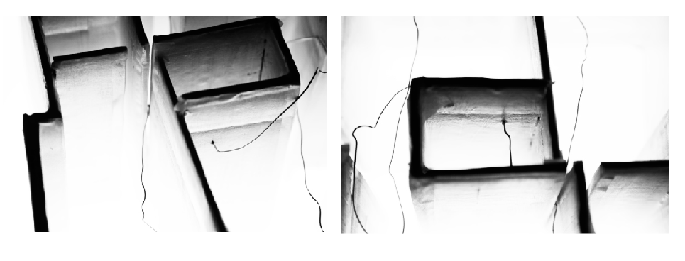
I used paper to cut through the house plan, Photographed it from the front view and then from the top view. Looking into a situation from different angles says a lot about different ways we can look at a situation. The super slim page that created the separation became this barrier that not only didn’t let you see the rest of the place but also felt to tall and strong that stopped you from moving forward. These are all quick studies that can be used later on as a mean for communication. And of course this was not the end point of this study and it can look into much further.


I also tried looking into wires and creating separation within this space but I put it on hold there and moved back to my drawing and decided to look into them further. 


Milestone 2:

I started the investigation on the drawing with the map of San Francisco. Gave them checkpoints at the conduction of two borders. Based on the checkpoints I recreated a wall and draw the effects of the new wall on the divisions.


By drawing and emphasizing on the divisions I realized the closer you get to the middle of a division the further away you will be from the other divisions (isolation). 


I don’t think these studies were not good but the many decisions that I took would have many meanings within San Francisco. My intention was to pick the map of San Francisco because people could relate to it and maybe how it is to divide the city but the same reason ( a familiar place) would create many many more questions about the decisions I took. Therefor I decided to simplify the studies and I moved into simple square spaces that I didn’t need to analyze all the divisions. I could pick the center of the square and just assume everyone wants to move towards the center, where as in San Francisco my viewers might have argued and disagreed on the center of the city. At this point I wanted to study the drawing and their condition and not the reason behind the decisions. bellow are the example of some of my studies.